How Color Psychology Influences Perfume Box Appeal
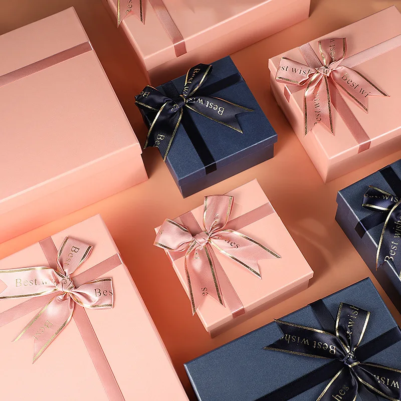
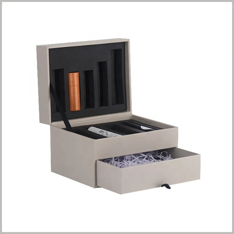
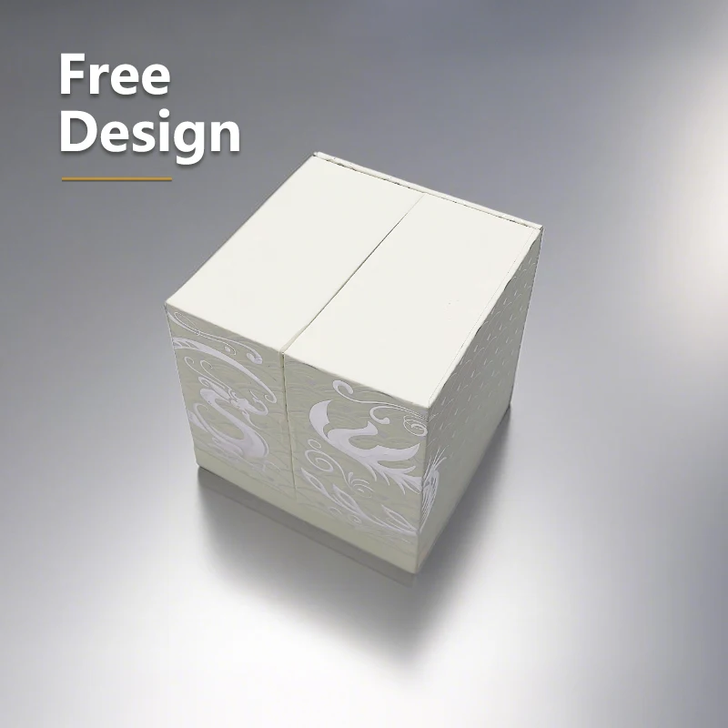
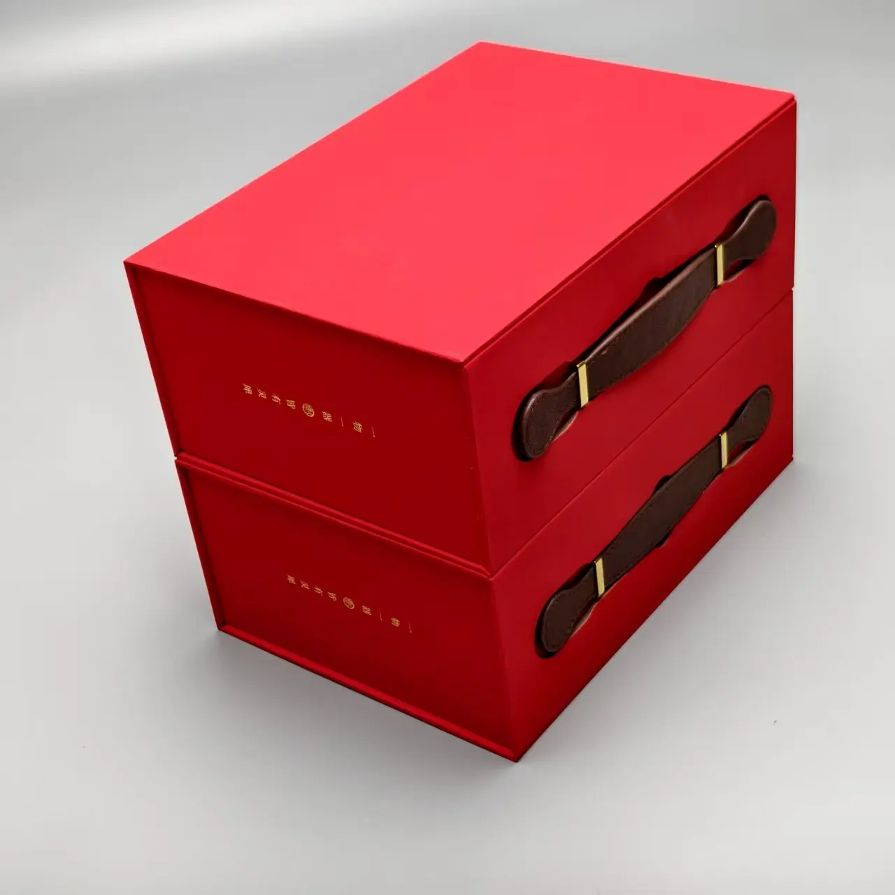
Color psychology works wonders when it comes to perfume packaging, turning simple boxes into real emotional magnets. Studies show most people form pretty strong opinions about a brand within just seven seconds of seeing it, and around two thirds remember those first impressions forever (Sensory Marketing Journal reported something like that back in 2023). Gold and copper shades scream luxury, which makes sense why they're often paired with warm, sweet scents like amber and vanilla. On the flip side, white and blue packages tend to go hand in hand with fresh summer fragrances because they just look clean and cool. Some interesting research from the Olfactory Research Group found that teal-colored packaging actually makes people think a fragrance will last longer on their skin by about twenty-two percent compared to boring neutral colors. High-end brands take this further by using matte finishes instead of shiny ones. When customers run their fingers over these smooth surfaces in blind tests, they somehow rate them as feeling eighteen percent more premium than regular glossy stuff. But wait, there's a catch. Things get tricky in certain parts of the world. For instance, many shoppers in the Middle East see black packaging as something reserved for special events rather than everyday wear. This means perfume companies need to tweak their color choices based on local customs if they want to connect properly with different cultures.
Aligning Perfume Scent Profiles with Strategic Color Schemes
Matching Colors to Fragrance Families: Floral, Woody, Citrus, and Oriental
Designers systematically pair fragrance families with colors that evoke their olfactory character. Citrus scents thrive in vibrant yellows and greens, mirroring zesty freshness, while woody fragrances align with deep browns and forest greens to convey earthiness. Floral compositions often use soft pinks and lavenders to mirror delicate petals, and oriental blends adopt rich burgundies or golds to express warmth. This alignment creates intuitive visual-olfactory connections, helping consumers instantly recognize a perfume’s scent profile through its packaging.
Using Color to Visually Communicate Scent Notes and Olfactory Identity
Color serves as a silent translator for scent notes—aqua tones evoke aquatic freshness, while gradients of amber signal spicy complexity. A 2023 University of Liverpool study found 68% of consumers accurately guess fragrance types based on packaging colors alone. This visual shorthand bridges language barriers in global markets, enabling brands to distinguish vanilla-rich “gentle fluidity” (packaged in gold) from crisp “aqua universalis” (encased in frosted blue).
Case Study: Chanel No. 5’s Classic Palette and Its Timeless Scent Alignment
Chanel No. 5’s minimalist white-and-gold box has anchored its floral-aldehyde identity since 1921. The stark white signifies purity, while gold accents amplify luxury—a strategy validated by market research showing 79% of consumers associate monochrome designs with premium quality. This color continuity ensures instant recognition across generations, proving strategic palettes can outlive trends when aligned with a fragrance’s core identity.
Trend Analysis: Pastel Tones for Feminine Scents and Bold Hues for Masculine Lines
Current markets show pastel lilacs and blush pinks dominating feminine perfume boxes, reinforcing delicacy and romance. In contrast, masculine lines embrace navy blues and charcoal blacks to signal strength—a trend growing 23% annually since 2020. However, gender-neutral fragrances are disrupting this dichotomy, with brands using neutral beiges and muted greens to appeal to broader audiences through adaptable color semantics in perfume box design.
Luxury Signaling Through Premium Colors in Perfume Box Design
Conveying luxury with black, gold, and metallic finishes
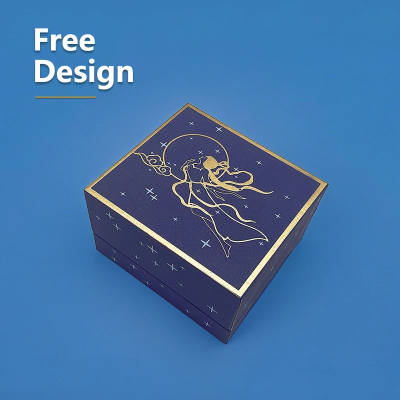
When it comes to fancy perfume boxes, color choices tell stories about what lies inside. Black has always been the go-to shade for luxury brands, and numbers back this up too. According to industry reports from last year, over six out of ten top-tier fragrances hit shelves wrapped in predominantly black packaging. Then there's gold, which adds that extra touch of glamour. Studies indicate that when manufacturers include gold foil details on their premium containers, customers tend to accept prices that are around 22 percent higher than standard options. It makes sense really – we associate certain colors with specific values, and these associations run deep in our purchasing decisions.
Matte black and monochrome designs as symbols of sophistication
Modern luxury brands are shifting toward matte textures and tonal palettes to convey minimalist elegance. Monochromatic schemes in slate gray or ash brown create visual cohesion while allowing fragrance names to dominate label designs—a trend particularly effective for gender-neutral perfumes targeting Gen Z audiences.
Color differences between luxury and mass-market perfume box designs
Luxury boxes employ deep-toned base colors with metallic detailing, contrasting sharply with mass-market competitors’ frequent use of white backgrounds and CMYK-processed imagery. Premium brands allocate 23% more budget to specialty finishes like soft-touch lamination compared to standard gloss coatings in affordable lines.
Data insight: 73% of consumers associate gold accents with premium fragrances (Nielsen, 2022)
The Nielsen 2022 fragrance packaging study reveals metallic elements directly impact purchase decisions, with gold detailing scoring highest for sophistication perception. Luxury manufacturers pair these accents with structural innovations—embossed logos and magnetic closures in midnight blue boxes increased perceived product value by 17% in consumer tests.
Debate: Is minimalist monochrome packaging losing emotional connection?
While clean designs appeal to younger demographics, 41% of luxury buyers aged 35+ in a 2024 focus group described monochromatic boxes as "emotionally sterile." This tension drives innovation in texture contrast, with brands layering matte black substrates with glossy metallics to balance modernity and traditional luxury cues.
Cultural and Global Color Preferences in Perfume Packaging
Cultural Meanings of Color: White in Asia, Red in the Middle East
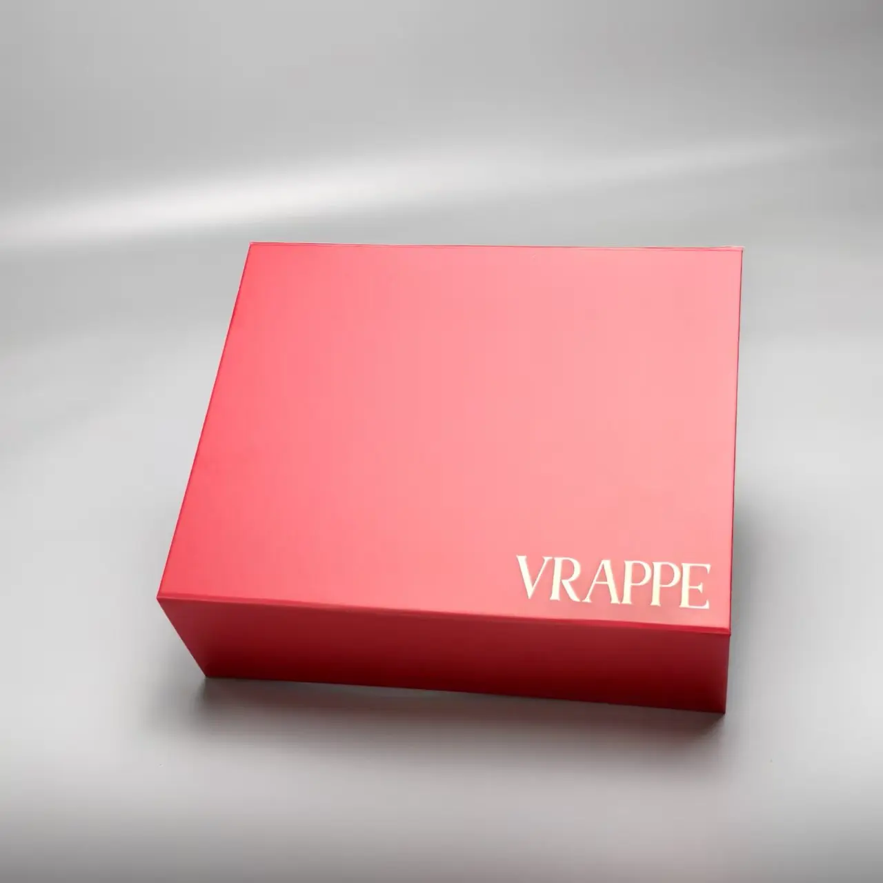
The meaning behind colors changes a lot depending on where people are from, so understanding local culture is really important when designing perfume boxes. Take white packaging in Asia for example it stands for clean and fresh in Japan, but means sadness and loss in China. On the other side of things, around two thirds of folks in the Middle East see red perfume boxes as something fancy and special according to that Global Fragrance Report from last year. Because of these differences, perfume companies need to check what colors mean in different regions before they start printing. Some smart brands have learned this lesson the hard way, like how Indian markets prefer maroon tones over bright red since red is closely tied to weddings there. Getting this right makes all the difference between connecting with customers or accidentally offending them.
Regional and Seasonal Trends in Fragrance Color Choices
Where people live and what kind of weather they experience tends to influence their color preferences quite a bit. Take perfume makers in Europe who often go for soft blues and creamy whites during springtime collections. Meanwhile down in tropical regions, folks just love those vibrant greens and coral tones all throughout the year. The seasons themselves play a role too. Think about it - during holidays in the Middle East, fragrances packed with warm amber notes and golden hues tend to sell like hotcakes because these colors match up so well with local celebrations and customs. According to research published last year from the Packaging Culture Institute, nearly 6 out of 10 shoppers actually take note of whether a fragrance's colors fit the season before making a purchase decision.
Adapting Perfume Box Design for International Markets Using Color Intelligence
Leading brands use localized color strategies to bridge cultural gaps. For example:
- Adding gold accents to perfume boxes in Southeast Asia to emphasize premium quality
- Using muted earth tones in Scandinavian markets to align with minimalist aesthetics
Recent analyses by cosmeticsdesign.com reveal that 41% of global beauty brands now employ regional color consultants to optimize perfume packaging. This “color localization” approach reduces cultural misfires by 33% compared to uniform global designs.
Emerging Trends in Perfume Box Color and Visual Design
Maximizing Shelf and Digital Visibility Through Strategic Color Use
These days, perfume companies are going all out with bold color combinations that stand out both on store shelves and when snapped with phone cameras. Think bright gradients from coral to gold or those shiny metallic finishes that catch the eye no matter where they're viewed. The goal? Make sure these bottles grab attention whether someone is walking past them in a shop or scrolling through their phone. According to a recent industry report from 2025, almost seven out of ten people who buy fragrances actually find what they want first on Instagram Reels. This has created a whole new market for packaging designs that pop especially well in vertical videos since that's how most folks watch content these days on their smartphones.
Sustainable Packaging and the Rise of Earthy, Natural Color Palettes
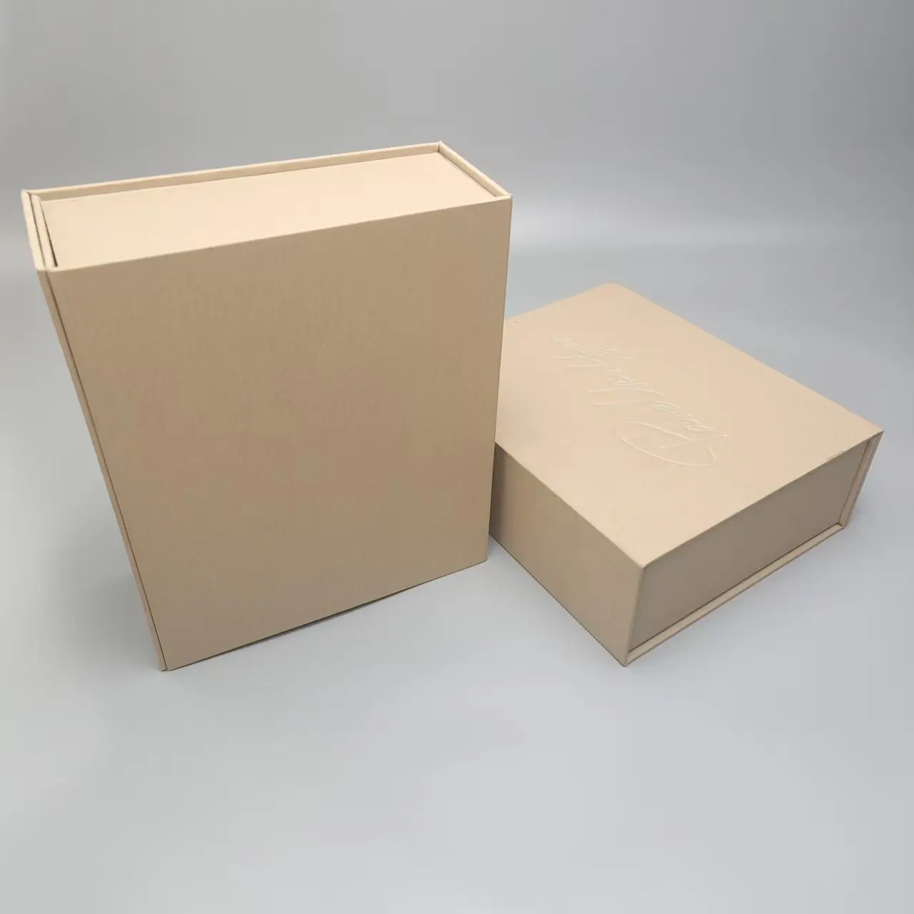
Brands focused on environmental responsibility have started incorporating colors like terracotta, raw linen textures, and soft moss greens to signal their green credentials visually. These natural shades work well with recycled paper materials and inks derived from plants, helping tell a consistent story about sustainability to customers who care about ecological impact. According to recent market research from the Consumer Fragrance Trends Report released in 2025, packages featuring warm neutral tones such as clay and sandstone actually score 23 percent higher when it comes to how "natural" they appear compared to standard white packaging options. This suggests that color choices play a bigger role than many realize in shaping consumer perceptions around product authenticity.
Future Forecast: Holographic Effects and Biophilic Color Schemes in 2025
Next-gen perfume box designs will feature iridescent holographic finishes that shift between complementary colors (turquoise-to-lilac, bronze-to-emerald), leveraging advanced printing techniques. Simultaneously, biophilic schemes will pair forest greens with sky-blue accents to evoke natural landscapes—a response to 81% of millennials preferring fragrances that “transport them outdoors.”
Frequently Asked Questions
How does color psychology impact perfume box design?
Color psychology influences how consumers perceive and emotionally connect with a fragrance, affecting their purchase decisions based on packaging.
What are the common color schemes for different fragrance families?
Citrus scents use vibrant yellows and greens, woody fragrances align with deep browns and forest greens, floral compositions often opt for soft pinks and lavenders, while oriental blends adopt rich burgundies or golds.
How do cultural preferences affect perfume packaging?
Different cultures attribute various meanings to colors, impacting packaging designs. For example, white symbolizes purity in Japan, but is associated with sadness in China.
What trends are emerging in perfume box design?
Emerging trends include sustainable packaging using earthy colors, holographic finishes, and designs that maximize visibility on digital platforms.
Table of Contents
- How Color Psychology Influences Perfume Box Appeal
-
Aligning Perfume Scent Profiles with Strategic Color Schemes
- Matching Colors to Fragrance Families: Floral, Woody, Citrus, and Oriental
- Using Color to Visually Communicate Scent Notes and Olfactory Identity
- Case Study: Chanel No. 5’s Classic Palette and Its Timeless Scent Alignment
- Trend Analysis: Pastel Tones for Feminine Scents and Bold Hues for Masculine Lines
-
Luxury Signaling Through Premium Colors in Perfume Box Design
- Conveying luxury with black, gold, and metallic finishes
- Matte black and monochrome designs as symbols of sophistication
- Color differences between luxury and mass-market perfume box designs
- Data insight: 73% of consumers associate gold accents with premium fragrances (Nielsen, 2022)
- Debate: Is minimalist monochrome packaging losing emotional connection?
- Cultural and Global Color Preferences in Perfume Packaging
- Emerging Trends in Perfume Box Color and Visual Design
- Frequently Asked Questions